Smaller (scaled) logos for Mythweb’s Elkin theme
I really do like MythTV, mostly because I like fiddling with things for hours to make them ‘just so’. Since 0.23 I have even started thinking it’s almost straight-forward to set up. My only complaint has been that mythweb, the web-based interface, had a very dated look and feel. I only use the mythweb for scheduling recordings and checking out what to watch, and with the help of DynDNS I can get to it from anywhere, a feature which Sky have only cottoned onto recently.
Then the elkin theme came along. It is a bit light and fluffy, but the grey-on-white is much brighter and cleaner than the previous default theme, and much more modern. The only problem is the channel icons (in the UK at least) are massive, leaving only four or five channels on the screen at any one time.
Fortunately the fix is quick and simple. You will need to edit a single CSS file for the TV listings, tv_list.css, which is stored in the skins/elkin/ directory of mythweb. On Mythbuntu Maverick this is /usr/share/mythtv/mythweb/skins/elkin/tv_list.css.
Change the entry for channel images:
.x-channel img {
    position:           relative;
    top:                -4px;
    vertical-align:     middle;
}
to:
.x-channel img {
    position:           relative;
    top:                -4px;
    vertical-align:     middle;
    height:             40px;
}
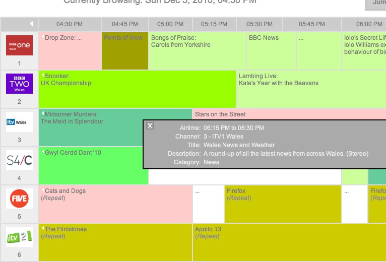
Adding the height value shrinks the icons down so you get more information onto a single screen, so it ends up looking like this:
It is of course possible to tackle this problem in another way - resizing the images manually will probably end up with a crisper image on the webpage. Before 0.23 I had written a script to make imageMagick scale the a larger version of the logo (from the same source) to 40px height, and then add rounded corners to it. The final look was excellent, but the script went the way of many un-backed-up things, and I’m back to square corners again.